As in our printed communications, the information we post online should be quickly accessible and visually consistent with the Ozarks Technical Community College (OTC) brand. The more intuitive and simple the organization, the more likely the user will interact with and return to the site. Websites should be able to stand alone and give visitors a sense of the brand with every click. They also have the ability to link the many different departments together to show the extensive reach OTC has in the state, nation and world. From type to photography to tone, all the design elements can be used here to help advance the brand through this very powerful medium.

The OTC web design was built with all devices (desktop, laptop, tablet and mobile) in mind and is responsive to each one. All websites are managed with OTC’s content management system, referred to as OTCPress.

Official college web pages should meet basic accessibility standards and provide information in an alternative format as needed. Documents designed to be downloaded should be provided in both a text-only format and portable document format (PDF) when possible. A text-only transcript should be provided if an online slide show or presentation contains academic or instructional text and visual elements. Multimedia presentations that convey only “emotional” appeal may not require alternative descriptions.

Employing a fixed but flexible format guarantees greater control over the page design and ensures the consistent look of the page displayed on common web browsers and platforms. Therefore, the fixed page width for the official college site on a desktop display will not exceed 1280 pixels. It will respond to other devices from that size down to 300 pixels for mobile phones.

The OTC websites will provide visitors with a consistent navigation system on every page. Navigation includes a graphic element containing links and the official OTC wordmark at the top of the page and a text version of the site navigation containing copyright and web policy at the bottom of each page.

OTC’s website has three standardized page layouts that are deployed so that visitors have the same access to information on each major page through the website. These key pages are:

  1. Front pages (departments, key college pages, etc)
  2. Our Team pages
  3. Contact Us pages

Front Pages

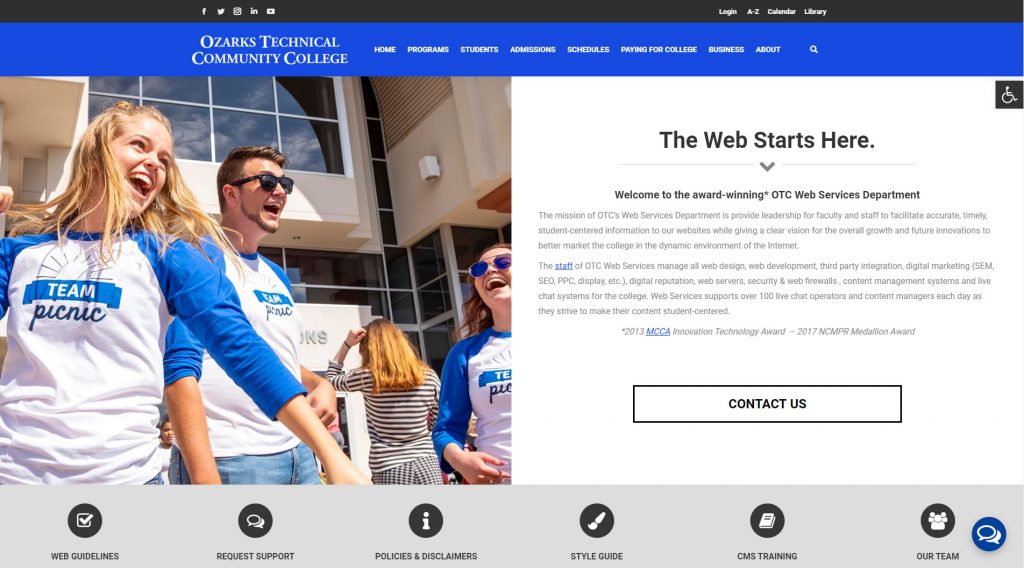
front page example
A. Each front page should follow the same content order which is:

  1. Image/video (if used), title, intro paragraph, icon buttons, social, bottom contact
  2. An example of a full-featured front page is located here: https://students.otc.edu/admissions

B. Each page should either have four, five, or six icon bar links.

Note: The only exception to this is when a clean video is deployed on a page and the title is moved to the top of the page.

Our Team Pages

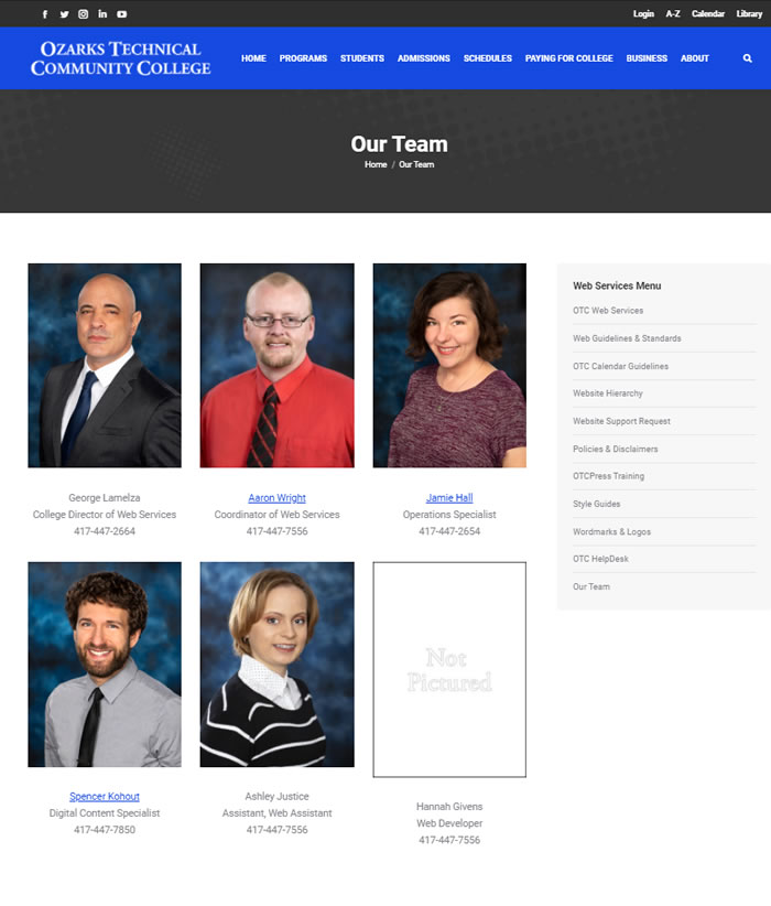
our team example

A. Each Our Team page should have two, three or four images in a row.

  1. Two image layout example:https://about.otc.edu/chancellor/cabinet/ 
  2. Three image layout example: http://web.otc.edu/our-team
  3. Four image layout example:http://students.otc.edu/registrar/our-team/

B. Pages should only list names, titles and phone numbers.

  1. If the individual does have a bio, a separate page should be created with the biography information on it.
  2. A correct biography layout should look like: https://about.otc.edu/chancellor/cabinet/joan-barrett/

Contact Us Pages

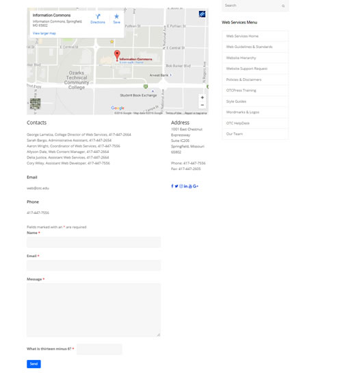
contact-exampleEach Contact Us page should follow the same content order which is:

A. Title, map (if used), contact info and contact form

  1. Example of a contact page with wide map: https://news.otc.edu/contact-us/
  2. Example of a contact page with a regular map: http://web.otc.edu/contact-us
  3. Example of a contact page with no map but with a form: https://academics.otc.edu/cul-hsm/contact-us/

Note: accordions for contact pages should only be used when encompassing more than one contact. An example of a contact page with an accordion being used properly is: http://about.otc.edu/contact-us

Content managers should only use styles that are the default settings on all websites. If a content manager wishes to change the font to emphasize a section, only Web-friendly type fonts should be used. For example, Arial and Georgia typefaces were specifically designed to be used on computer screens while often-used Times New Roman was originally designed for print publications. Other popular web-friendly type styles include Verdana and Trebuchet. By sticking with the standard fonts within OTCPress, visitors to the website will get a consistent and user-friendly picture of the college.

Black or other color backgrounds can hinder type legibility and present an accessibility obstacle for those with vision difficulties. The optimum background color for a page is white (#FFFFFF). The use of background textures by designers will often reduce page load speed as well as conflict with the visual appeal of the site.

The existing OTC Style Guide requires that only the approved OTC wordmark and logos be used on the website. The approved OTC logo should always have a neutral area of no less than the measurable width of the interior arch in all directions. For effective legibility, the approved OTC logo should only be used against a white background on the web. The insertion of other logos on web pages should be consistent with the existing design standards.

The college has approved standard colors available for use for websites online, which are: 

Primary Colors Web
Bright Blue: #154AE1 (Web Only)
Dark Blue: #00447C*
White: #FFFFFF
Black: #000000

Secondary Colors Web
Yellow: #FECA0B*

Light Gray: #dddddd (Web Only)
Cool Gray: #A7A9AD*
Dark Web Gray: #333333 (Web Only)
Dark Gray:
#231E20*

Tertiary Colors Web
Pink/Purple: #D0108E*
Green: #71C044*

Discontinued Colors as of 01/01/2022

Orange: #F59D1D (Limited)

Color uses vary, but generally, all text and links should follow the following: 

Normal text – #000000 (black)
Alt text – #333333 (dark gray)
Background – #FFFFFF (white)
Link – #154ae1
Alink – #666666
Vlink – #999999

Bright Blues, dark blues, cool grays, pink, and greens can be used as row backgrounds, buttons, and accent colors. They may NOT be used as font colors. All fonts should remain the standard colors. 

*Denotes OTC Color Palette with its origination in Print as of 02/28/2022

Requests

All image, photograph, and graphic requests MUST be submitted to Created Services at: https://news.otc.edu/service-request/  Web Services does not manage the college image archive. 

All images, photographs, or graphics must be provided in the following formats: .jpg, .png, or .gif. The Office of Web Services has the authority, based on college policy, to remove any image, photograph, or graphic that does conform to brand standards, website publishing policy, or website guidelines. 

In some cases, an executed OTC College Media Release form should accompany photographs containing identifiable individuals destined for official college web pages.

Updates

Additionally, Web Services can assist in the update of images on your website once you have requested and received them. Please note that if you plan to mass update images across your website or system-wide, please use the spreadsheet below to assist in the process. Once completed, it can be mailed to web@otc.edu and cc helpdesk@otc.edu.

The OTC website is built on a responsive platform. When you insert an image, it will adjust to the surroundings. However, ideal image sizes make the presentation and loading time more enjoyable for the visitor. If OTC Web Services designs the site on your behalf, please provide the full image. We will convert it to the proper size. 

Any images sent to us from a department or the college’s creative services department should be the full image. 

However, if you are placing the image on your page, use the general guidance below: 

  • Slider Image: 1920px x 800px. The focus of this image should be on the absolute center of the image.
  • Group image, banner image, announcement image (with right menu column): 650px X 450px(ideal) 700px X 550px (max)
  • Banner Image (without right menu column): 980px X 450px (Ideal) 980px X 550px (max)
  • BioImage: These are typically at an aspect ratio of a standard 5″ x 7″ photo. When sized down, ideally, they appear on the website as 300px X 400px images based on the responsive website display.

Below is a chart to help find the right image size. All image sizes are in pixels using width by height format.

Image Type

Ideal Size

Max Size

Slider Image

1920 X 800

1920 X 800

Small Slider Image 

1920 X 500

1920 X 650

Group, Banner, Announcement
(With right menu column)

650 X 450

700 X 550

Banner
(Without right menu column)

980 X 450

980 X 550

Bio Image

300 X 400

300 X 400

When in doubt, send the full quality image to Web Services and we can edit it down to fit the page correctly.

If the college is marketing your area or department. The following are display ad sizes we may use. 

AdRoll
300×250*, 320×50*, 728×90, 300×600, 970×250, 160×600,

Google

300×250*, 320×50*, 320×100, 336×280, 728×90, 300×600

Geofencing

320×50*, 300×250*, 320×480, 728×90, 600×300, 720×240, 640×213, 640×160, 640×320, 480×320, 768×1024, 1024×768, 640×960, 640×360 and 160×600.

Facebook & Instagram

See: https://www.facebook.com/business/ads-guide?

  • Minimum ad sizes. 

The web requires a different set of writing standards, and all web content should be optimized. Much like the guidelines for a reporter, the information pyramid should be applied to all web writing. For example, visitors should find content with the most important information in the lead paragraph.

Because web visitors don’t read long galleys of text, they will often resort to printing a deep web page instead of online reading. If you are planning on creating a page with long text sections, you might consider an alternative approach.

Utilizing the web convention of “chunking” can provide page developers with an effective tool. Content optimization or “chunking” will often result in long text being converted to bulleted lists. If the visitor is interested in greater detail, the designer can provide an alternative resource.

Detailed, extensive content can be offered to the visitor in both a text-only format or as a PDF. Unfortunately, developers who offer only a PDF may disenfranchise those with accessibility issues because some versions of Adobe Acrobat Reader cannot be used by assisted technology screen readers.

Another effective tool for presenting extensive content is the use of numerical, hierarchical or alphabetical lists. When in doubt, consider a bulleted list instead of a long paragraph. Try to limit web sentences to no more than 25 words. When writing or assembling web content, write only half of what you would normally write for the printed medium (example below).

Effective content tools:

Convert important data to bulleted lists.

  • Limit sentences to no more than 25 words.
  • Consider PDF and Text or MS Word downloads for long documents.

You should prepare web text in a word processing program that provides the author with a spell-checking feature. The auto-hyphenation feature should be turned off and items like bullets should not be employed because they will not easily transfer to HTML format.

The content provider policy provides a structure for updating sections of the web. Each content provider should review materials in their current web section and work with the designated group chairperson and OTC web team in an effort to keep the site current and accurate.

To better serve the needs of visitors and to ensure that we provide accurate and up-to-date information, content providers should avoid duplicating the following college materials in individual department web sections:

  • Program descriptions ( see www.otc.edu/programs )
  • Course descriptions ( see www.otc.edu/catalog )

For more information on writing for the web, see the detailed page at: https://web.otc.edu/webdesign/writing-for-the-web/ 

You can also contact Spencer Kohout at 417-447-7850 or email web@otc.edu for additional content writing assistance. 

Like our college, our users are diverse. Site content needs to be accessible and useful to all of those users. OTC is committed to delivering accessible web sites and requires that sites comply with requirements outlined in section 508 of the United States Government’s Rehabilitation Act.

Web usability standards are achieved if everything works as anticipated by the user. The visitor should be able to understand the purpose of the site and navigate throughout the site without getting lost. The pages should load quickly and not require extensive scrolling. Employed technologies should be readily available to the visitor. All of this should take place in a matter of seconds in a web world where the visitor is in control.

The OTC website has been developed in accordance with web conventions for accessibility. The following represent basic accessibility standards for the public websites:

  • Always use ALT tags to describe the content of graphics or photographs.
  • When linking a graphic, provide a caption under the image that also serves as a text link.
  • Provide a Text or Microsoft Word transcript of slide shows that contain academic or instructional text and visual elements.
  • Provide captioning or include a Text or Microsoft Word transcript for Videos that contain academic or instructional audio elements.
  • Provide the visitor with an approximate download time, file size and file type for large multimedia files when they will require download times in minutes versus seconds.
  • Design web pages that load quickly and generally don’t exceed 200 kilobytes in size.
  • Optimize all photographs and images.
  • Enter the height and width attributes of all images.
  • Avoid GIF animations. Consider JavaScript sliders as an alternative.
  • Provide alternative mechanisms for online forms like an available telephone number, e-mail address or a word processing document version of the form for download.
  • Limit the amount of fields for online forms to 12.
  • Do not use Blink or Marquee.
  • Make sure that content in tables work sequentially in support of accessibility.
  • Try to avoid the Blockquote. This tag hinders screen readers and Braille devices.
  • Make sure that the web page can be accessed in most common browsers and platforms through testing.
  • Do not use frames.
  • For graphs and charts, provide a summary within the web page or provide a text link to another web page that contains the summary.
  • Hypertext links should be descriptive of their destination. Avoid “click here.”
  • Provide timely and accurate content. Remember to carefully edit and “chunk” information into short, readable paragraphs and bulleted lists.
  • Abide by existing college policies including the Responsible Use of Electronic Communications.

The Office of Web Services provides ongoing support for the development of official college websites. Members of the OTC community skilled in web design are always encouraged to work with the web team in blending their creative ideas into the existing format and standards.

Major search engines use keywords to find your web page. Their organic search will determine your ranking or position in a search result. The keywords in your page content must match those words appearing in the hidden page script. Keywords should be limited to no more than 5 words that are specific to the product or service offered or described in the site. The selection of general keywords will lessen the effectiveness of SEO.

Search engine marketing (SEM) uses the same keywords to deliver qualified visitors to tiny online advertisements that appear on the right rail of most search engine pages. The SEM program requires web marketers to select keywords and geographic locations for advertisement placement. Once selected, the marketer must bid on the keywords to determine if the return on investment (ROI) for the keyword string matches the allocated marketing funds. SEM works best when the keyword string is very specific.

An institution of higher learning has endless video opportunities. Events, guest lectures, concerts and interviews make up the fabric of web video content.

Before campus constituents begin the process of producing a video destined for a college website, they should contact the College Director of Communications in order to make sure that the project does not replicate other planned work, is consistent with the mission of the institution and will support the college’s web design and video standards.

Online streaming video has become commonplace on the web as part of the explosion of social media. Online resources like YouTube and Vimeo that allow the user to simply upload a video, edit online and post live have contributed to growth. Most of these videos can be embedded into standard web pages.

While the use of video on the college’s websites is encouraged, we require producers to follow a visual branding protocol that identifies them as products of OTC (see below). No matter how wonderful the video may look and sound, it is the content that matters to the viewer. With that in mind, those producing videos must follow the college’s content protocols (see below).

Video of Non-OTC Individuals
Video recording of non-OTC individuals will require an executed Media Release form by those appearing in the video if it is to be used by the college.

High-Definition
All video should be shot in high definition (1280 x 720) to meet evolving web convention. Audio is an important component of a video and clear, crisp audio is essential (AAC codec).

Time Limits
Web videos are most effective when limited to no more than three minutes in length. Please consider editing the video content into several smaller segments to avoid longer videos.

Visual, Branding and Content Protocols

  1. The college logo must appear in the first frame.
  2. The HD logo currently being used must appear in the next frame.
  3. The title of the video or identification of who is appearing in the video must appear in the next frame.
  4. All individuals being interviewed must be identified (a narrow name bar at the bottom of their first frame is essential).
  5. The use of “B” roll video/images enhances most videos and should be used when possible (inserting a still photo or background video under someone speaking).
  6. The video must try to tell a story (storyboards are recommended).
  7. The last frame must contain the college logo and web address. In some cases, a prior frame may contain web links to information about an event or website.
  8. The individual(s) appearing in the video should be engaged with the camera. They should be looking at the camera at all times unless they are being interviewed where interaction is required.
  9. The limited use of copyrighted material (video/audio) may be subject to limitations. The use of such material should be discussed with the Director of Web Services.

YouTube Videos

  1. The college logo must appear in the first frame.
  2. The HD logo currently being used must appear in the next frame.
  3. The title of the video or the person appearing on screen must be identified.
  4. The college drop-shadow logo must appear in the upper right corner of the video because YouTube will drop their logo in the lower right portion of the video. This exception is the only one regarding the use of the college logo in a video.
  5. The use of “B” roll video/images, inserting a still photo or background video under someone speaking, enhances most videos and should be used when possible .
  6. The video must try to tell a story (storyboards are recommended).
  7. The last frame must contain the college logo and web address. In some cases, a prior frame may contain web links to information about an event or website.
  8. The individual(s) appearing in the video should be engaged with the camera. They should be looking at the camera at all times unless they are being interviewed where interaction is required.
  9. The limited use of copyrighted material (video/audio) may be subject to limitations. The use of such material should be discussed with the Chief Media Relations and Issues Management Officer.

Note: All videos placed on any OTC website must either be hosted on an OTC web server or reside on an OTC social media account or video channel where the college has direct control to add, edit or remove them from the web.

OTC deploys various forms across its websites. All content managers are expected to use the internal forms system offered by Web Services. If another form system is necessary for a particular function, the department must obtain prior approval from Web Services before deploying it on the website.

Keeping sites fresh and accurate requires consistent updates, revisions and modifications. Sites should be built for simple, efficient management and evolution. Web management tools should be chosen based on the needs of the sites’ managers and contributors, not simply the web developers or programmers.

For answers to additional questions please contact the Office of Web Services at web@otc.edu or call 417-447-7556