Building the framework for your website’s content

Galley kitchen or open floor plan? One-story or two-story? Gas or wood-burning fireplace? From Bungalow to Craftsman, Cape Cod to Colonial, knowing what a homeowner wants and expects guides the type of home an architect designs.

Building a website isn’t exactly like building a house, but understanding what your users want and expect plays a similar role in determining the structure and framework for how you design and organize the content and navigation on your website.

Now that we’ve taken the time to understand how your users expect content to be organized and what terminology they use, we will create your website’s information architecture.

What is Information Architecture?

Information architecture is the structural design of a website, showing how organization and labeling can help users find and use your content. Information architecture focuses on your users, how they navigate through your site, what technology they use, and what content you provide.

Information architecture produces site maps (website structure) and wireframes (design blueprint) to convey how the site will work from a practical perspective.

What is a site map and how do I read it?

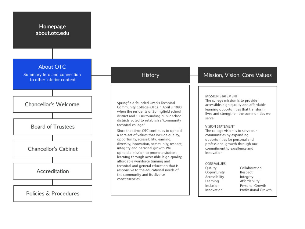
A site map is a planning tool that visually shows how the information will be grouped and labeled, where content will be located, and how a user will move through your website. It lists the pages and content organized in a hierarchical fashion that should be read from top-down, from left to right. All websites already have an xml site map that can be viewed at https://domain/sitemap_index.xml. For about.otc.edu it would look something like: https://about.otc.edu/sitemap_index.xml with the relevant sitemap being located at: https://about.otc.edu/page-sitemap.xml. Below is a visual sample: 

simple sitemap about otc

Homepage

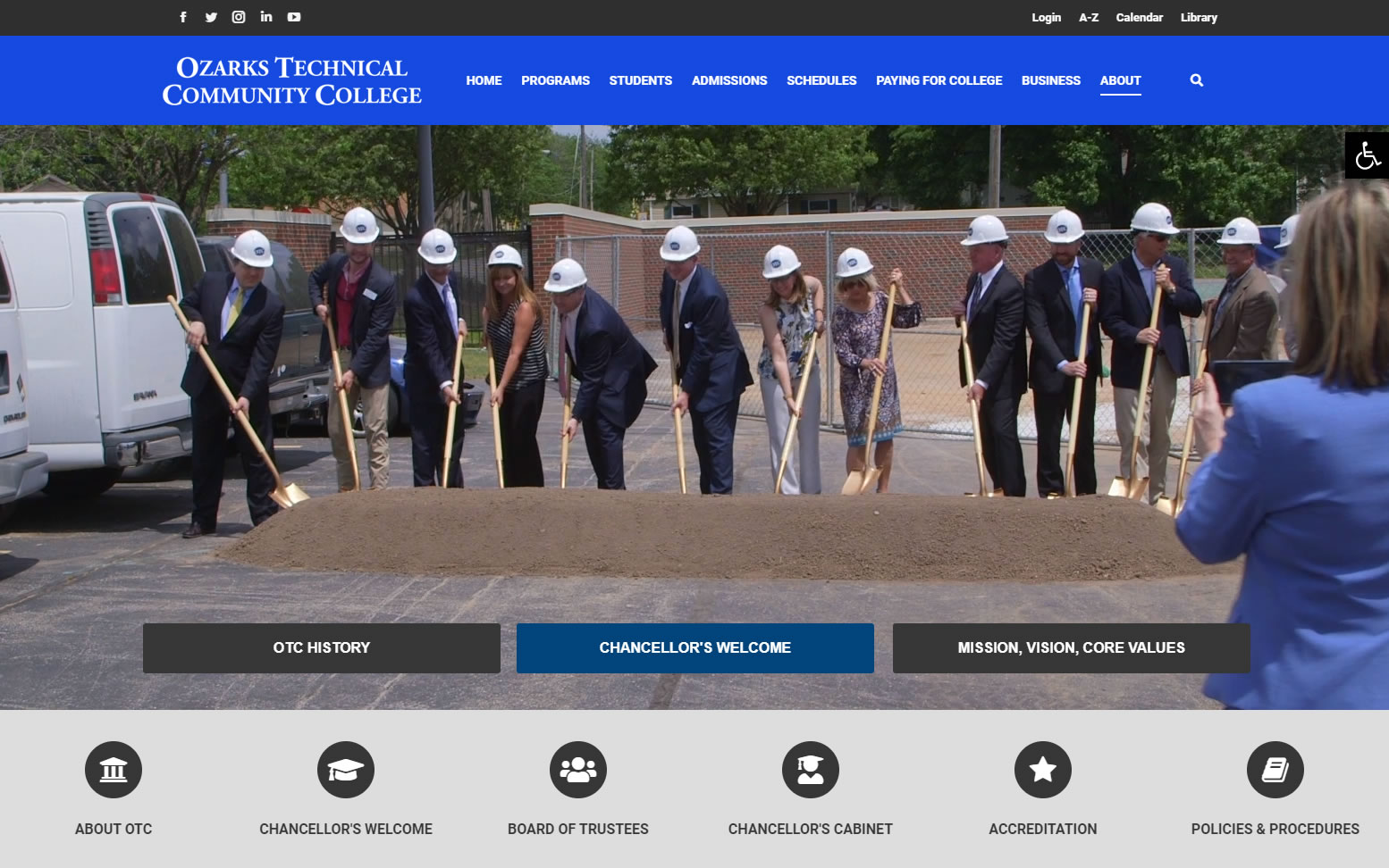
At the top of the site map is your homepage. The information listed there is what will be shown on your site’s homepage (key messaging, a brief description of your department and what it does, a list of upcoming events, testimonials about your department, etc.)

about homepage

Primary Navigation

Below the homepage information is the primary navigation (the primary navigation listed horizontally as icons below the image or video on the page).

Department Primary navigation is:

  • The starting point of your user’s journey through your website
  • Located on the home page as icons, but are expanded on interior pages with a side menu. 
  • Consistent throughout the entire website task-based (not audience-based except for very special circumstances) – Read Five Problems with Audience-Based Navigation
  • 4-6 sections of content that users are most interested in visiting
  • Read from left to right, so prioritize your tasks starting with the most important / most used tasks on the left
  • Links to a separate landing page that either give all the information on that topic or introduces additional pages (secondary navigation)

In this example of the about.otc.edu you can see the primary navigation below or visit the website. 

about primary navigation

Secondary Navigation

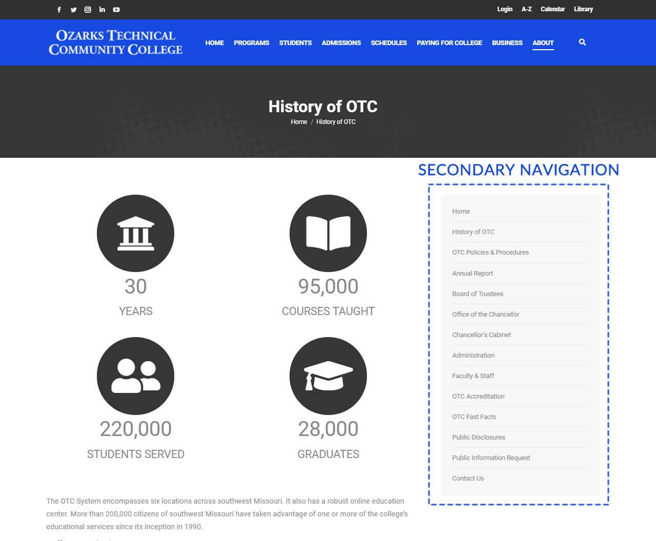
All of your content may not always fit in one large menu, no matter how organized it may be. It may then become necessary to use secondary navigation. Any content that does not serve the primary goal of the website but that users might still want to visit should go in the secondary navigation.

Each of the secondary navigation elements is a separate webpage that the user lands on when they click on the secondary navigation link. These will be presented in a box on the right side of the pages associated with the primary navigation.

secondary nav